
Photo 1:
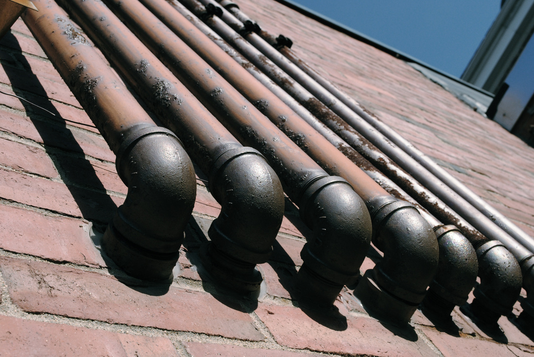
This photo, similar to one I took for our very first assignment, is representative of both that assignment, but also has a strong point of view, with my camera having been angled in order to have the pipes all included in the frame, as well as create a sense of depth by including the most of the pipes that I could. By showing the most that I could, it becomes visible with them being thicker down where they start, to gradually becoming thinner, as they are extending up the building and out of the frame. I also like to see the shadow coming off of the pipes, which on the bottom of the photo, can create a sense that the pipes start further down than they actually do, if looked at from afar, or looked at as a smaller photo as opposed to full-size. However, I will admit that I experimented with the curves and levels within this photo, to establish a different mood, coming from a more muted color scheme, which seems to carry an overtone of grey, as opposed to one of a sort of brown, rusty color, which the pipes are originally.
Photo 2:
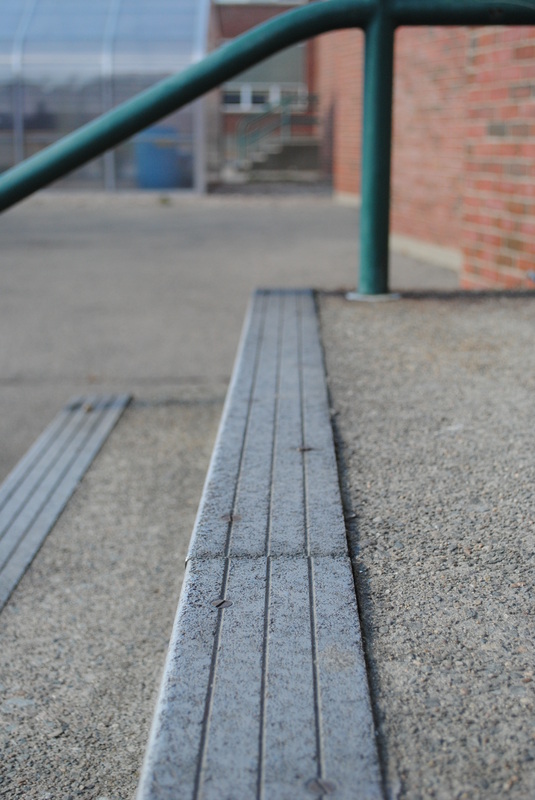
I took this photo for our depth assignment, with my camera sat directly on the top step, far enough back to view both the top step in almost its entirety, as well as a second step, and the railing, which frames the top of the photo. In terms of composition, the photo can be broke down into thirds vertically, with the background and the railing comprising the first third, then the farthest back portion of the stairs for the second, then the part of the stairs right in the front, those not only closest, but clearest, for the third third. I appreciate the fact that the railing also provides a sort of pop of color that isn't present in most of the photo. The first third seems to have collected all of the color in the photo, which the leading lines on the stairs lead you to.
Photo 3:
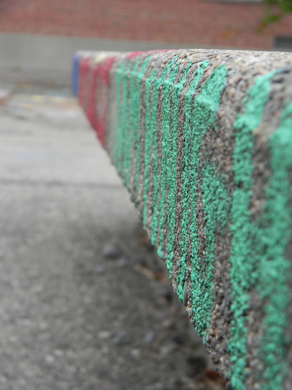
This photo was taken on our very first expedition out of the classroom, and it automatically became my favorite, if not one of my favorites. It's something that I would have regretted not taking, because my other attempts at it when we left the classroom for depth, were not as successful as this one is, although in order to take this one, I managed to get myself ditched by everyone else in the class, but that's perfectly okay, considering the end result. You can essentially follow the writing down the side through the whole photo, considering it spans the whole side. The most interesting element of the photo to me though, is the fact that while it does spell out names, from this angle you cannot read the names, and one might not even know what the writing was, if you weren't provided any frame of reference to where the photo was taken. I also really like that the colors change, from a secondary color to two primary colors.
Photo 4:
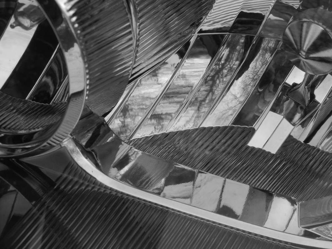
Although I know right away what this photo is, others might have some difficulty, from the up-close range which I took this shot at. So, I'll start off by saying it is an up-close shot of a headlight on a car. It has multiple reflections, as it reflected itself further, which really helps to make this shot dynamic. I did end up making this shot black and white, because in color, my camera is easily visible in the upper right hand corner, but now in black and white, it blends in better, and makes the photo stay cohesive. Taken for Shadow and Reflection, it also has some depth, with leading lines on that same upper right side, with the lines moving upwards and through that extent of the photo. There is also a singular line around the bottom, which breaks the busy atmosphere and brings in the calmer elements of the light, which I did not photograph a lot of.
Photo 5:
I utterly adore this subject matter, as I should considering I made it several years ago, but I never was able to photograph it properly. However, using the SLR, which this is the only photo which I used one, I was able to have most of the sequins in focus, only getting blurry around the edges of its shape. While I wish that I could get more of a sense that it is actually three dimensional, or at least have some shots of both, I do like just the more so flat view which this photo provide.
Photo 6:
As opposed to one of my landscapes photo, in which the plant is green and the background is comprised of shades of brown, this photo has the plant being dead/dying, in a soft tan and grey color scheme, and the background in shades of green, the inverse of my other photo. With that said, the plant itself really does not look like something that one would want to be near, or even touch, which is what I like about it. It is a brash plant, something that looks angry or like it has been hurt, as opposed to photographing more tame plants, which was to my surprise, considering I did not know how the photo was going to work out. This specific photo, out of the array that I took, was the most calm, with the others really struggling with the wind a lot more. However, you can tell that the wind has had some impact, with parts of the plant being swayed to the right, but not enough that it makes the photo overall blurry, thankfully.
This photo, similar to one I took for our very first assignment, is representative of both that assignment, but also has a strong point of view, with my camera having been angled in order to have the pipes all included in the frame, as well as create a sense of depth by including the most of the pipes that I could. By showing the most that I could, it becomes visible with them being thicker down where they start, to gradually becoming thinner, as they are extending up the building and out of the frame. I also like to see the shadow coming off of the pipes, which on the bottom of the photo, can create a sense that the pipes start further down than they actually do, if looked at from afar, or looked at as a smaller photo as opposed to full-size. However, I will admit that I experimented with the curves and levels within this photo, to establish a different mood, coming from a more muted color scheme, which seems to carry an overtone of grey, as opposed to one of a sort of brown, rusty color, which the pipes are originally.
Photo 2:
I took this photo for our depth assignment, with my camera sat directly on the top step, far enough back to view both the top step in almost its entirety, as well as a second step, and the railing, which frames the top of the photo. In terms of composition, the photo can be broke down into thirds vertically, with the background and the railing comprising the first third, then the farthest back portion of the stairs for the second, then the part of the stairs right in the front, those not only closest, but clearest, for the third third. I appreciate the fact that the railing also provides a sort of pop of color that isn't present in most of the photo. The first third seems to have collected all of the color in the photo, which the leading lines on the stairs lead you to.
Photo 3:
This photo was taken on our very first expedition out of the classroom, and it automatically became my favorite, if not one of my favorites. It's something that I would have regretted not taking, because my other attempts at it when we left the classroom for depth, were not as successful as this one is, although in order to take this one, I managed to get myself ditched by everyone else in the class, but that's perfectly okay, considering the end result. You can essentially follow the writing down the side through the whole photo, considering it spans the whole side. The most interesting element of the photo to me though, is the fact that while it does spell out names, from this angle you cannot read the names, and one might not even know what the writing was, if you weren't provided any frame of reference to where the photo was taken. I also really like that the colors change, from a secondary color to two primary colors.
Photo 4:
Although I know right away what this photo is, others might have some difficulty, from the up-close range which I took this shot at. So, I'll start off by saying it is an up-close shot of a headlight on a car. It has multiple reflections, as it reflected itself further, which really helps to make this shot dynamic. I did end up making this shot black and white, because in color, my camera is easily visible in the upper right hand corner, but now in black and white, it blends in better, and makes the photo stay cohesive. Taken for Shadow and Reflection, it also has some depth, with leading lines on that same upper right side, with the lines moving upwards and through that extent of the photo. There is also a singular line around the bottom, which breaks the busy atmosphere and brings in the calmer elements of the light, which I did not photograph a lot of.
Photo 5:
I utterly adore this subject matter, as I should considering I made it several years ago, but I never was able to photograph it properly. However, using the SLR, which this is the only photo which I used one, I was able to have most of the sequins in focus, only getting blurry around the edges of its shape. While I wish that I could get more of a sense that it is actually three dimensional, or at least have some shots of both, I do like just the more so flat view which this photo provide.
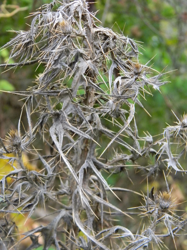
Photo 6:
As opposed to one of my landscapes photo, in which the plant is green and the background is comprised of shades of brown, this photo has the plant being dead/dying, in a soft tan and grey color scheme, and the background in shades of green, the inverse of my other photo. With that said, the plant itself really does not look like something that one would want to be near, or even touch, which is what I like about it. It is a brash plant, something that looks angry or like it has been hurt, as opposed to photographing more tame plants, which was to my surprise, considering I did not know how the photo was going to work out. This specific photo, out of the array that I took, was the most calm, with the others really struggling with the wind a lot more. However, you can tell that the wind has had some impact, with parts of the plant being swayed to the right, but not enough that it makes the photo overall blurry, thankfully.
